Is your website “mobile friendly” a/k/a Mobile Responsive?
If not, it can cost you important SEO rankings and customers as well. Potentially half of them, since Google Analytics Data shows that more than half of all web traffic comes from smartphones and tablets.
Responsive Web Design (RWD) is the craft of providing an optimal viewing experience for a website across an array of devices, including mobile phones, tablets, laptops, and desktop computers. TyTech Solutions specializes in editing the CSS code for websites so it is easy to view and navigate across all of these platforms, resulting in higher click-through rates, user engagement, and ultimately – ROI.
To tell if your website is mobile-friendly, there are a few quick steps you can take to determine if you need responsive web design services.
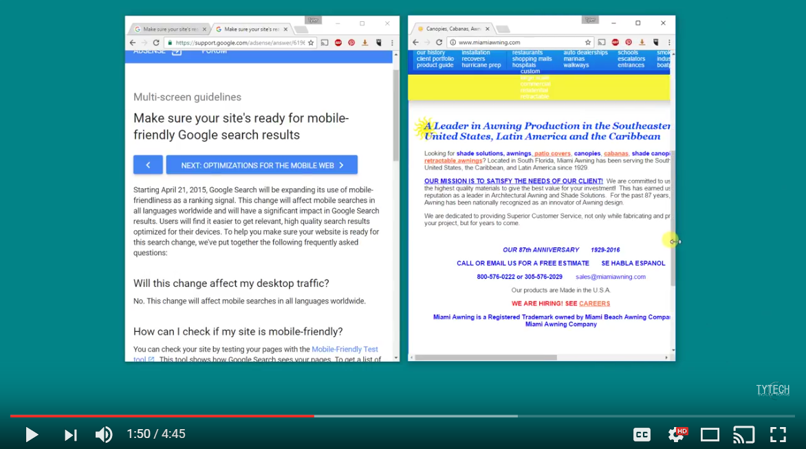
In this article, we are going to go over 3 quick ways to tell if your website, or any website for that matter, is mobile friendly – without having to physically check it on every possible device! Having a mobile-friendly website not only affects the type of experience visitors will have (especially since at least 50% of web traffic is now done on a mobile devices, such as a cell phone or tablet, but it also can affect your search engine rankings on sites like Google, Yahoo, and Bing. As of April 2015, Google officially announced it will use mobile friendliness as a ranking signal for search results.
Step 1. – The Browser Window
The quickest, and easiest, way to check the mobile responsiveness of a website is by adjusting the the dimensions of the browser window itself. You can do this by simply dragging the edges of the open window and adjusting the width. If the site is mobile responsive, you should see the media and content start to collapse or arrange itself in a way that would be readable no matter what size the window is. This may be the fastest way, but one set back is you don’t have the exact dimensions readily available to pin-point which exact screen size needs work.
Step 2. – Developer Tools
To gain more specific information about screen resolution sizes and have more control over your testing, the use of in-browser developer tools are the way to go.
To access the developer tools window on Google Chrome, Right Click -> Inspect -> Toggle the Device Toolbar (device icon). Similarly, to view this feature on Mozilla Firefox, just right click on the web page, click ‘Inspect Element’ and find the icon which represents the device toolbar (square).
From here, you can adjust your view across multiple devices.
Step 3. – Third Party Websites
In addition to the first two methods, it is also possible to toggle and view different screen sizes for free by visiting one of several websites that let you check the mobile responsiveness of a page.
While there are many, some of the most popular online tools for this are Mobile Responsive Design Testing by Studiopress, the Mobile-Friendly Test by Google, and Screenfly by QuirkTools.
There you have it, 3 quick methods you can use to help you determine if a website is mobile responsive – without having to leave your computer.
If you found this article helpful, please feel free to share it with your favorite network and contribute to the comments section. Thanks!
Leave A Comment
You must be logged in to post a comment.